
A few months ago I started noticing the same kind of photo everywhere under “Bible study aesthetic” on Pinterest: a highlighted Bible page, a few handwritten notes in the margin, nothing fancy. No pretty flat-lay, no perfect flowers. Just someone’s real page. And the comments on those pins weren’t about how pretty they looked. People were asking what highlighters wouldn’t bleed through their paper, whether a Bible with no margins could even work for this, and — the one that stuck with me most — whether it was “bad” to just copy down what someone else noticed instead of finding their own insight.
So before I show you my own system, I want to answer that last one first, because I think it’s the real question underneath all the others: there is no wrong way to do this. None. God speaks to each of us differently, because He made each of us differently. What jumps out at you on a page isn’t going to be identical to what jumps out at me, and it shouldn’t be. You’re not copying if you land somewhere different than I did. You’re just paying attention to your own life.
My color-coding system
I didn’t plan this out ahead of time. It came from just sitting with a passage and noticing that most of what I was reading fell into a few natural buckets — who God is, what He does, and what that means for me. Once I saw that pattern in one chapter, I started looking for it in others, and most of the time it’s there. Three colors, three categories, and the categories shift slightly depending on what the passage is actually doing. For Galatians 5 it became the old list versus the fruit of the Spirit versus the instruction to follow the Spirit. For Romans 8 it turned into God’s faithfulness, our questions, and the answer to those questions. The shape isn’t the point. Noticing the shape is.
If you’d rather have a system already laid out for you instead of building your own from scratch, my 52-Week Devotional & Prayer Journal works the same way — a page a week, structured so you’re not staring at a blank page wondering where to start.
No margins? Here’s what I actually do
My Bible doesn’t have wide margins built in for notes. When it looks like I have room to write, it’s really because that particular sentence or paragraph ran short and left white space at the end of a line — not because the page was designed for it. So that’s what I use. I write in whatever gap the text happens to leave me. And on pages where there’s truly nothing, I use a small sticky note instead, with my color key and a line of reflection on it. Both work. Neither is more “correct” than the other. If your Bible has zero room anywhere, the sticky note is genuinely the easier path, not a compromise.
The nine pages
Here’s what I marked up, chapter by chapter, and what each color meant to me in that moment:
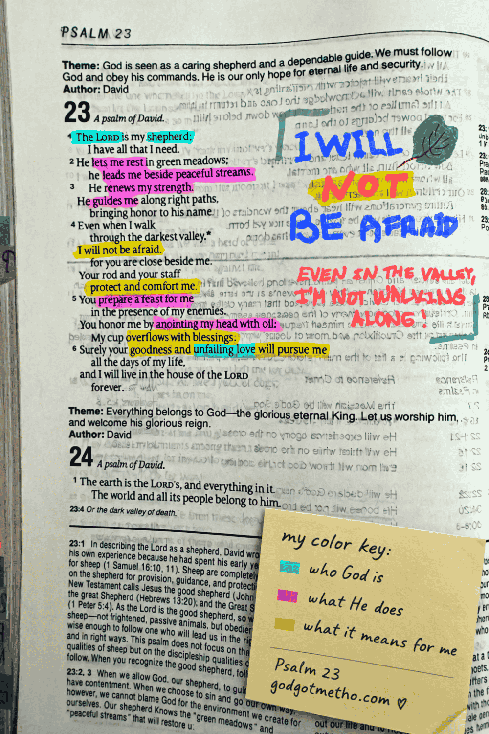
Psalm 23 — who God is, what He does, my response. I highlighted “shepherd” and “unfailing love” one color, His actions another, and my own “I will not be afraid” in a third. I wrote a line in the margin that had nothing to do with the verse itself, just what it meant to me that week: Even in the valley, I’m not walking it alone. If you’re walking through a harder season than this post has room for, this is the one passage here that comes closest — my Held in the Waiting grief devotional was written for exactly that kind of valley.
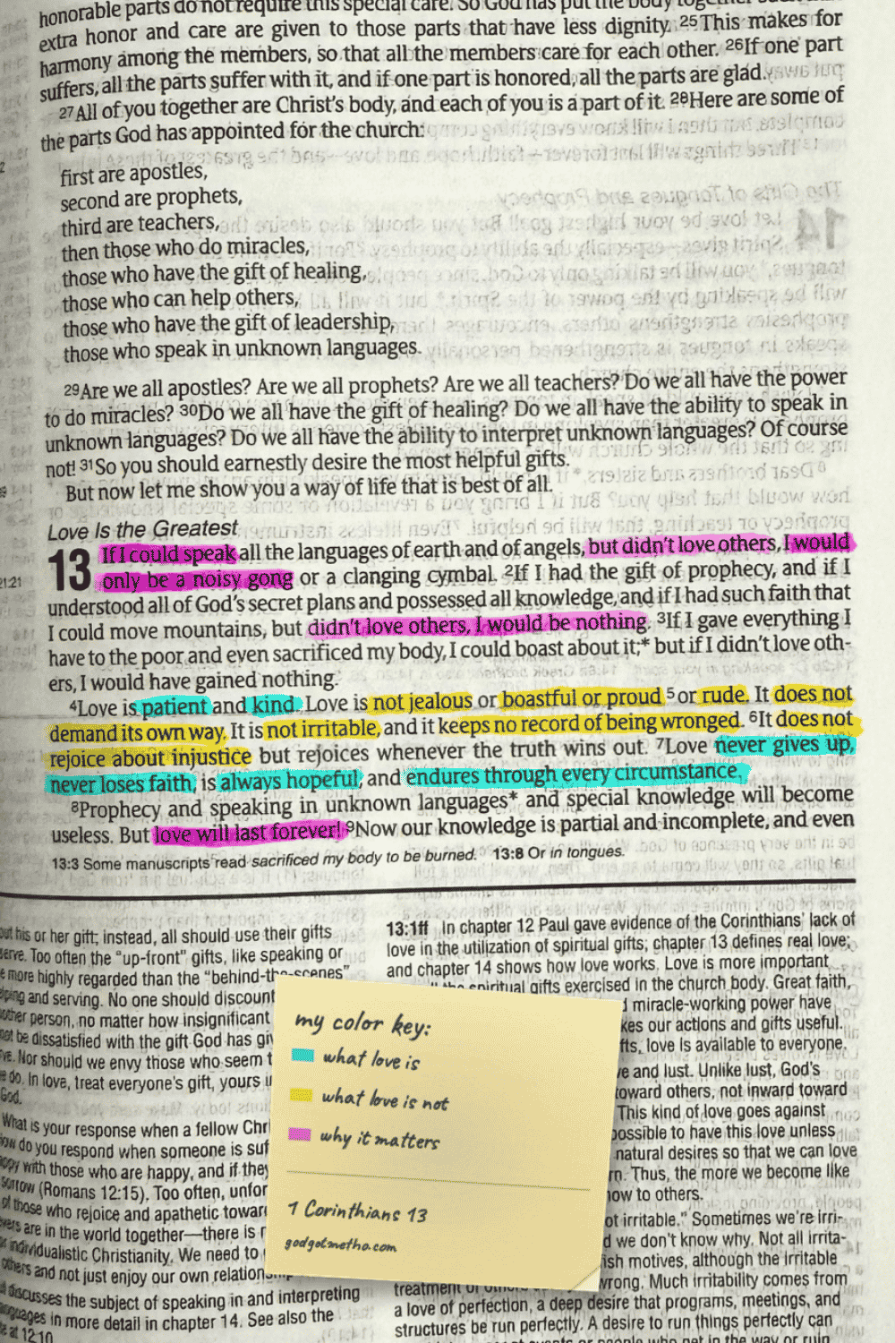
1 Corinthians 13 — what love is, what love is not, and why it matters. This chapter basically color-codes itself; Paul already wrote it in two lists.
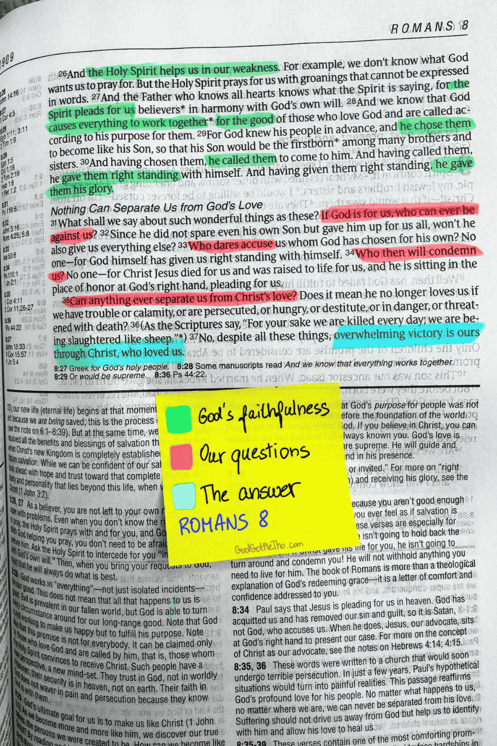
Romans 8 — God’s faithfulness, our questions, the answer. Verses 31 through 35 are almost all rhetorical questions, which made this one of the easiest passages to split by color.
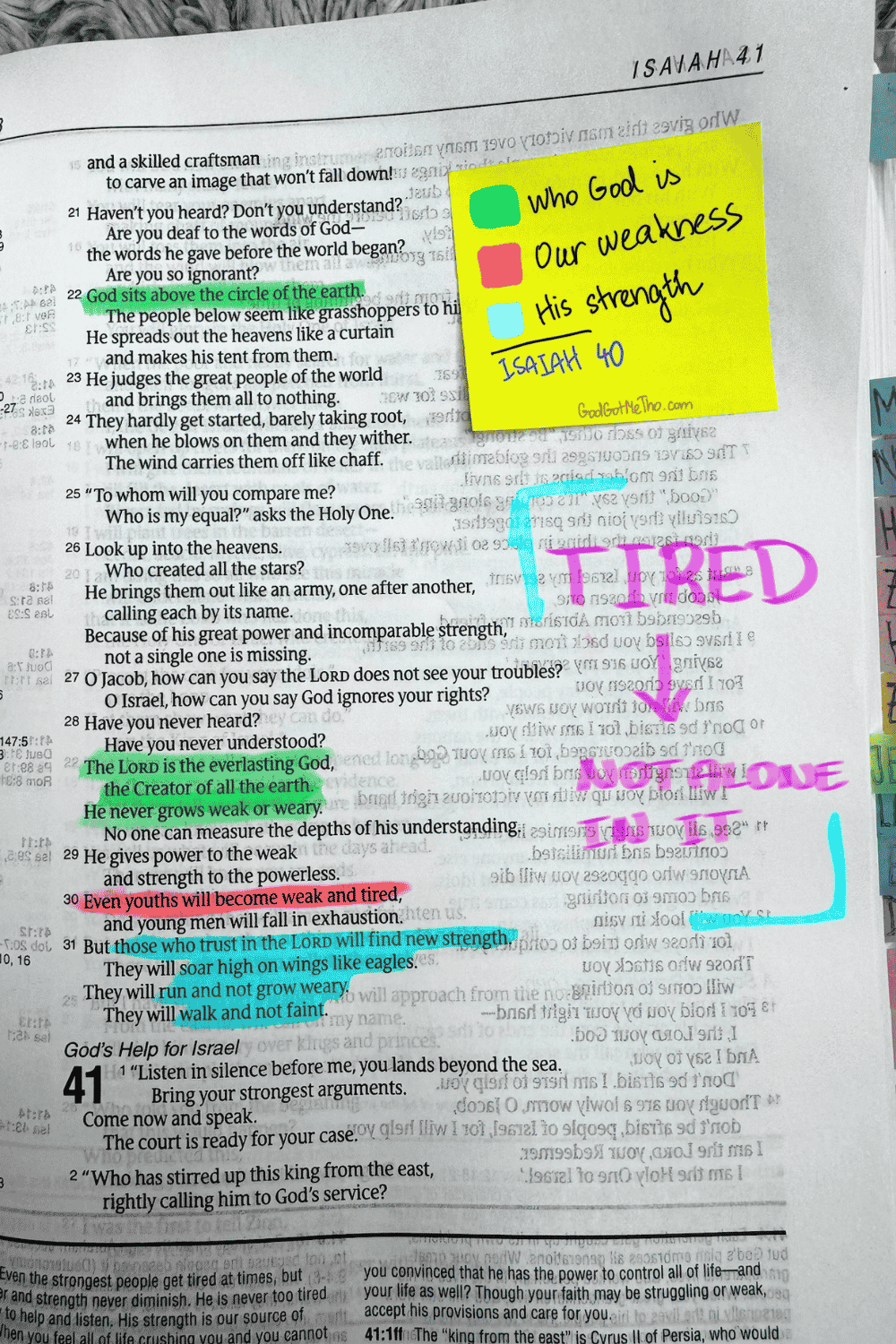
Isaiah 40 — who God is, our weakness, His strength. “Even youths will become weak and tired” got one color; “those who trust in the Lord will find new strength” got another.
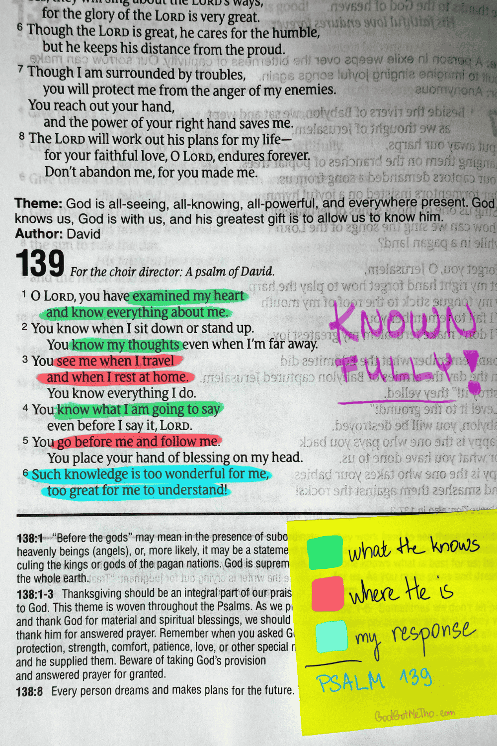
Psalm 139 — what He knows, where He is, my response. Short passage, but it covers an enormous amount of ground about being fully known.
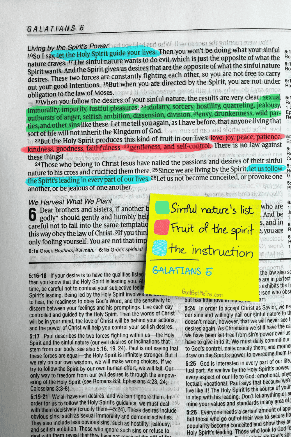
Galatians 5 — the old list, the fruit of the Spirit, the instruction.
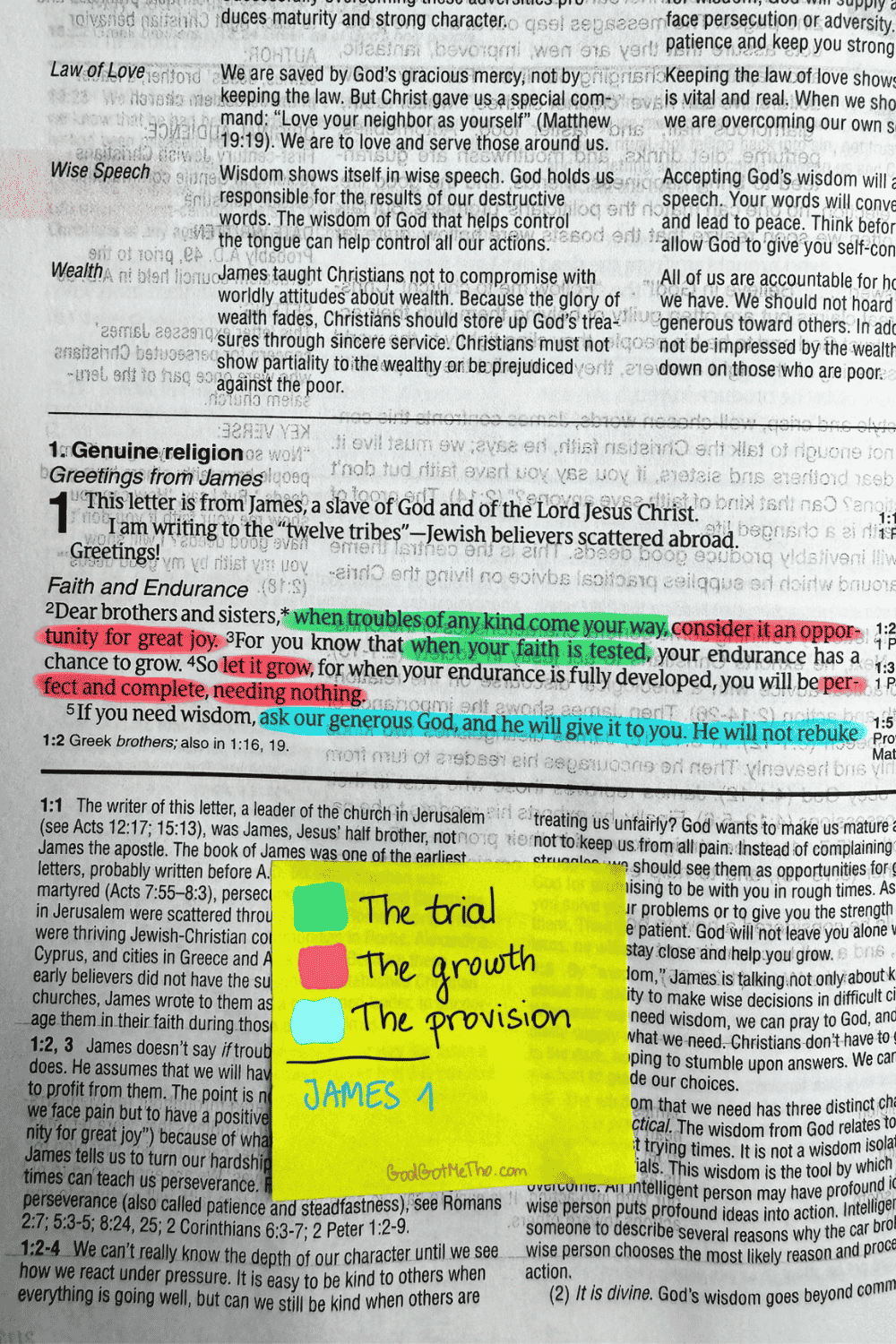
James 1 — the trial, the growth, the provision. “Consider it an opportunity for great joy” is not a sentence I found easy to color-code and agree with on the same day, if I’m honest.
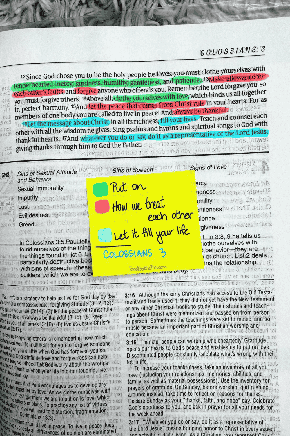
Colossians 3 — put on, how we treat each other, let it fill your life.
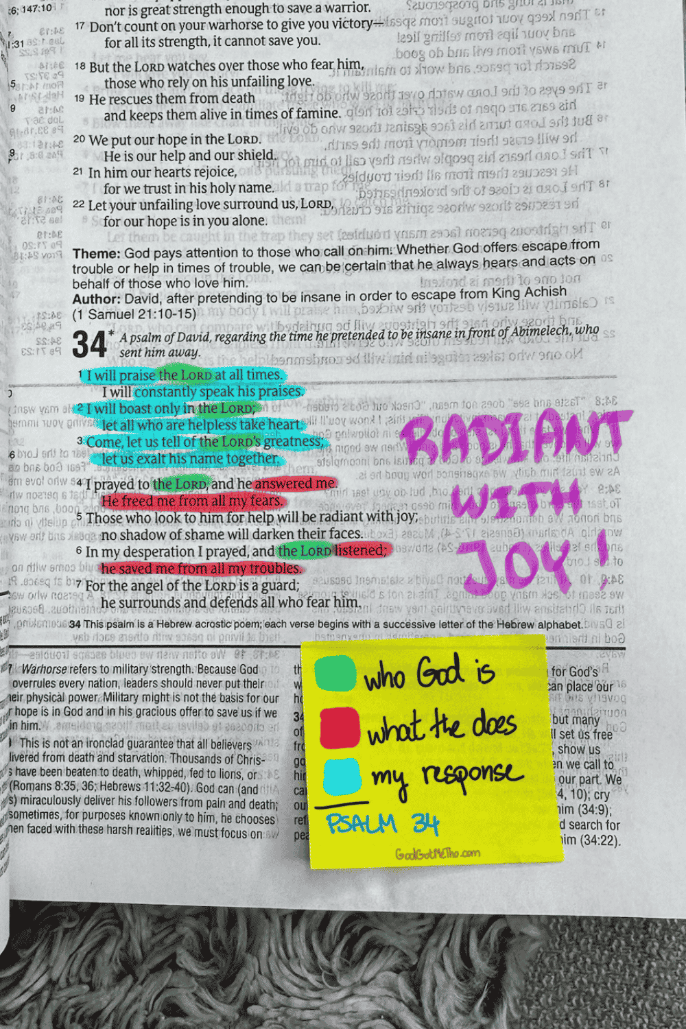
Psalm 34 — who God is, what He does, my response, with “radiant with joy” written out big in the margin because that phrase is the whole reason I picked this passage.
What to actually buy
If you want to try this and you’re worried about ruining a thin Bible page, skip regular highlighters. They will bleed through, every time, no matter what the label says. Look for Bible-safe gel highlighters instead — they go on like a gel stick rather than a wet marker, so there’s nothing to soak through the page. If you want something erasable on top of that, a dry colored pencil or an erasable highlighter crayon is the safest option there is, since there’s no liquid at all involved. Both are easy to find on Amazon under “Bible safe highlighters” or “no bleed highlighters.”
If you want a place to start, free
If this is your first time trying anything like this and a blank Bible page feels like a lot to figure out on your own, I put together a free 7-day mini Bible journal that walks through one small passage a day. No pressure to color-code anything, no system to copy — just a gentle way in.

This blog leans toward women, but the system doesn’t
This blog is written with a woman reading it, most of the time. But there’s nothing about this system that belongs to one gender. If you’re a guy and this is useful to you, use it. Color-code your Bible however makes sense to you. There’s no rulebook here.
And if you try this and the colors you pick don’t match mine, or don’t match what you picked last year, that’s not a failure. It might mean you’re in a different season now than you were then. That’s worth noticing too. The Bible study aesthetic trend is everywhere right now, but the version of it worth keeping isn’t the one that looks the prettiest. It’s the one that’s actually yours.
